Wednesday 12 February 2014

Website research: Lana Del Rey

The colour theme of the website is reflective of the artists work, this helps to create a huge brand identity for fans to be able to recognise and follow. All the items such as merchandise use the same font, style and layout creates ease for navigating around the website and adding to brand identity. The use of the Facebook like buttons and Tweeting buttons helps to spread the name of the artist as fans can display if they have just bought a ticket to her concert. 
News

Music

Gallery

Live

Sign up

Store

Tuesday 11 February 2014

Digipack analysis

Born to die - Lana Del Rey


Digipack analysis


Good kid M.A.A.D city - Kendrick Lamar

Digipack analysis

Blueprint 3 - Jay Z


Digipack analysis

This album has a dark, futuristic feel to it this if from the black background and the robotic looking mask which is placed in the center, the colors used on the mask are golds,silvers and blacks looking very sleek and advanced. In the top left hand corner states the name of the album in a flowing italics font almost like handwriting or signature, the style contradicts with the modern feel as it looks old fashioned but this effect really compliments the cover making it look like a work of art.


The disc cover adopts the same image used on the front, although this time the mask has been split into parts and placed either side of the disc. The exact same text dictating the the album name is written in the lower central area of the CD. At the top of the CD is the name of the artists group written in their recognizable font. 


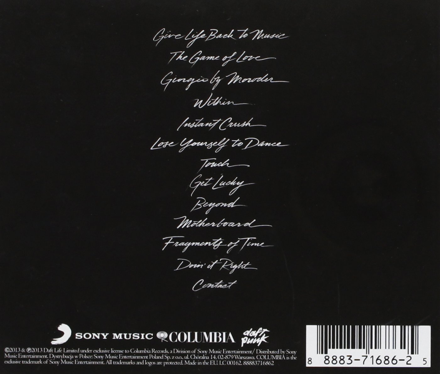
The back of the album digital booklet reveals the track list written in the same font as the album title in the exact same color, likewise with the color of the background being the same throughout. This page is very simple only with the display of the track list, and the credited section as well as the record label company names and the final display of the groups name "Daft Punk". Finally to the left of this is the bar-code.

Digipack analysis

In my mind - Pharell


The album cover is a cartoon image of Pharrell, centrally placed against a white background. The use of the cartoon adds humor and character to the cover as it is done in a simple style but made to look like a mimicked version of him with the same clothes, accessories and shoes. Below the cartoon is the name of the artist in a a black interesting font. The use of this font adds a little more excitement to the minimalist artwork making it visually pleasing to the eye. Moreover below the artists name is the name of the album written in a different font, this time in red, the red allows the text to stand out from the white background but not take all the attention away from the name of the artist. Lastly in the top right corner is the parental advisory warning label which helps alert buyers on the type of language and reference made in each album and if it is suitable for children. 


The back of the album cover shows a similar cartoon as shown on the front cover but with its back turned, referencing to the "back of the album" and a different outfit on. The same white background is used to keep in with the overall style. likewise the text listing the track list is written in the exact same font as the album name just in italics and black. Below the track list is the names of the record label, producing company and executive directors and to the right of that is the bar-code.